
We've all Been There, Done That. You are creating an Excel masterpiece formula when you are troubled, nagged, and thoroughly bugged by some error messages.
The following is a handy alphabetical listing of error messages and what they mean.
Full article: Errors, errors, everywhere!
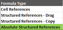
Structured Reference Tables are great for creating clean, easy to read formulas. But creating absolute references to the columns (aka anchoring the columns) in the formula is a bit tricky.
To create an absolute reference with structured references you need to add an additional and duplicate column reference. This tutorial shows you how.
Full article: Absolute formula references in structured tables
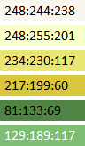
Colors can make or break a chart. Colors direct our eye movements, and therefore our brains and attention. It's up to you: will you help or hinder your reader's understanding?
Here are some simple strategies for communicating clearly with chart color:
- Strategy 1: Select a custom color palette.
- Strategy 2: Figure out if your categories are nominal, sequential, or diverging.
- Strategy 3: De-clutter by increasing white space and switching some black text to gray.
Full article: Nominal, sequential, or diverging? Simple strategies for improving any chart's colors
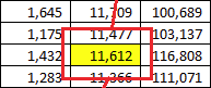
Here we have a simple data range of sales by month for a sales team. We want to easily find the value for a specific salesperson for a certain month. Now, with this small of a data set such as this, that's not too difficult to see, but let's assume your data was much more extensive.
Full article: Not available
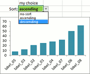
When a new chart is created, the order of the data is the same as on the worksheet. In many cases it would be helpful to see the data in ascending or descending order. In this article we would like to show you how you could avoid sorting the original data, and create a dynamic, sortable chart using named formulas.
The most convenient way to choose the sort direction is a validation list. You can choose no sort, ascending sort or descending sort and the chart will change immediately.
Full article: Sort the data on the Excel chart
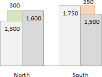
This post will explain how to create a clustered column or bar chart that displays the variance between two series.
The clustered bar or column chart is a great choice when comparing two series across multiple categories. The basic clustered chart displays the totals for each series by category, but it does NOT display the variance. This requires the reader to calculate the variance manually for each category.
However, the variance can be added to the chart with some advanced charting techniques.
Full article: Variance on clustered column or bar chart
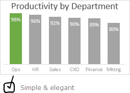
For every column chart that is done right, there are a dozen that get messed up. That is why lets talk about 5 simple rules for making awesome column charts:
- Start at zero.
- Thou shall sort.
- Slap a title on it.
- Axis & Grid-lines vs. Labels.
- Too much lipstick and you have a pig.
Full article: 5 simple rules for making awesome column charts

Handling duplicate data is well-known to be a vexing problem for many Excel users.
There are tools within Excel that simply delete all duplicate data, but there are times when it is more advisable to identify these duplicate values prior to eliminating them. Conditional Formatting can offer an excellent solution.
Full article: Handling duplicate data
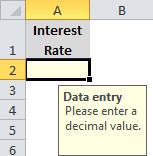
If you don't like the way Excel displays comments, try using the Data Validation feature to attach text to a cell. Excel will display the information only when a user selects the cell.
This technique is easy to implement, but it uses Data Validation in an unusual way so you might not think of it. It's a good tip to share with users because they can easily do it themselves.
Full article: Use Excel's Data Validation to display data entry tips for users