
22 August 2013
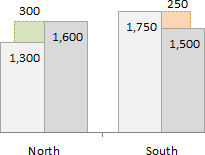
This post will explain how to create a clustered column or bar chart that displays the variance between two series.
The clustered bar or column chart is a great choice when comparing two series across multiple categories. The basic clustered chart displays the totals for each series by category, but it does NOT display the variance. This requires the reader to calculate the variance manually for each category.
However, the variance can be added to the chart with some advanced charting techniques.
Full article: Variance on clustered column or bar chart