18 March 2017
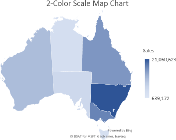
New in Excel 2016 (for Office 365 subscription users only) are Map Charts.
Excel map charts can display your data encoded by:
- Values with a 2-color scale.
- Values with a 3-colour diverging scale.
- By category.
This article shows some examples of how to create and format Excel map charts.
Full article: Excel map charts