
31 January 2016
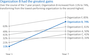
Data visualization basically comes down to two techniques: simplification and emphasis.
This article illustrates the techniques via an example:
- Simplify the graph: Remove the border, horizontal grid lines, vertical axis, legend, title, and the color!
- Emphasize your message with text: Add direct labels, a descriptive title, and a descriptive subtitle. Make sure the text is hierarchical.
- Emphasize your message with color: Match your graph's color palette to your organization's logo.
Full article: The simplification and emphasis approach to editing graphs