Authors
Delwyn Cooke, Leonard Blackwell, & Simon Brown
Abstract
Excel's "line chart" has several peculiarities that can yield misleading representations of data. However, in Excel 2010 it is possible to combine "line charts" with "scatter charts" which exacerbates the capacity to be misleading.
The use of the "line chart" in Excel should be considered very carefully. Everything that can be done with a "line chart" can be achieved with a little thought using a "scatter chart".
However, the real danger in Excel 2010 is the capacity to combine a "line chart" and a "scatter chart" which can be virtually undetectable and have unanticipated and serious consequences.
Sample

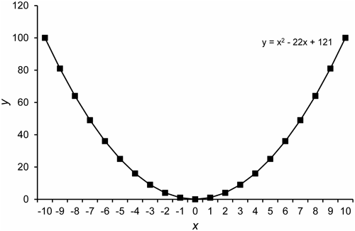
The trendline fitted to this data looks OK, but it is wrong.
The correct equation is y = x2. This error occurs because this is a line chart rather than a scatter chart. Therefore the x values used to calculate the fitted curve are 1 to 21 rather than the displayed labels of -10 to +10.
Excel provides no warning about the error.
Publication
2016, International Journal of Open Information Technologies, Volume 4, number 2, pages 7-10
